Orion Art at White Dog Studio

Welcome to the Orion Art at White Dog Studio Blog!

Look around...Enjoy the sights.

All artworks are for sale, contact me via this blog or at
maryann@orionwhitedog.com for inquiries. To see more of my paintings visit my website at http://www.orionwhitedog.com/

Thanks for visiting!
Showing posts with label Ohio landscape. Show all posts

Monday, January 23, 2012

Landscape, fits and starts


no title
oil on canvas
24 x 36

This painting started as something different; eventually evolved to this.  It changed because I didn't like where it was going.  At all.  Unfortunately Fortunately I don't have the beginnings painting documented.  I was so frustrated with how the painting looked that I was going to put a coat of color over it and start fresh with an entirely new piece. 
Instead I took a lithography pencil, palette knife, cut up credit card, an oil pastel, an old stiff paint brush and started drawing and scratching into the painting.  Which felt very good.
I began to like what was happening.  Energy was entering the piece. 
I rode the coat-tails of that energy and kept painting, feeling right about the new direction.
In the end, I find myself looking at the painting often.  Enjoying the layers of color, the leftover scratches and pencil marks. 


Here is a close up which shows detail and the subsequent layering of color and texture that happened after I almost scrapped the painting.

Title ideas anyone?


Tuesday, June 29, 2010

Loosening Up


Orchard Hills Park
6 x 8
Oil on Panel

Since summer vacation started I've gone out to the local parks to do some Plein Air painting.  Each time out has been totally wonderful.  I try to arrive around 7:30 or so and spend a few hours painting.  Last time I painted two panels, with this one being the better of the two.

Last year I painted this:

I liked it for a while.  Then I didn't.  The composition really started bugging me.  I loved the colors, the brushwork, but otherwise...blech.  So I decided to do a paint over the other day.  I zoomed in on the Orchard Hills painting.


Orchard Hills
Oil on Canvas
24 x 24

Now this, I really LOVE.  Loosening up is soooo good.

Some details:


This is color I could just Eat!


Thursday, June 24, 2010

Summer Vaca has started and I've hit the ground Running


                                                                Orchard Hills 6 x 8
                                                                                          oil on panel

Where to begin?  It's been so long since I've posted and there's so much to share and say.  For now I'll share a few pics of some little paintings I worked on this week.  The scenes were painted in a few different parks within the Geauga Park District.  What has been intriquing and of great importance to me lately has been negative space.  How it is used in an artwork.  I love the abstract shapes that negative space creates.


                                                                                        Orchard Hills  6 x 8
                                                                                            Oil on Panel

It was fun to mush the sky up against the trees and to paint the pinks behind the trees.


Swine Creek Park  6 x 8
Oil on Panel

This started as a demo piece, waterbased oils on panel.  I reworked it a smidge this morning (the demo was on Monday night) putting regular oils over the waterbased oils.  Which works just fine.  I also turned the painting upside down when I worked back into it.  (I revisited this idea courtesy of a friend who often paints her work upside down--she's not standing on her head, the work is upside down :) ) 
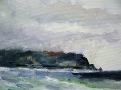

                                                                    The Rookery 6 x 8
                                                                                               Oil on panel

This is a painting from last summer that I was never felt was complete.  So, since I was turning paintings upside down, this one was flipped and worked into.  It's more intense than before, the colors and paint is getting nice and juicey.

Sunday, January 3, 2010

Woo Hoo! The commission is done!


Commission Painting
42 x 36


                                                        Diptych version of Commission Piece
                                                                             42 x 36

Finally!  The top painting is the commission painting I've been wrestling with for the last few months.  I'm fairly satisfied.  I'll send the image to the gallery owner, she can show it to the buyer.  After that, who knows, either she likes it or not. The background trees are more purple than blue.  I made some value adjustments in the sky and in the background trees.

I love the diptych, which I'll send along with the other.  Again the blues are more purple.  The center horizontal line is a vivid pinkish orange--melon.  It is bolder line than the photo depicts.

On a weather note, it has been snowing all day and night.  Snowing to beat the band!  I measured at 11:00  and there were 13 inches on the ground.  5 hours later, I'm guessing 18 inches or so. 

Sunday, December 13, 2009

Gray Day


After spending an hour or more working on this; the commission piece that is taking its good old time reaching any sort of resolution, I switched over to a fast painting over an old painting. 
(a side note about the commission:  the buyer saw one of my smaller paintings (8 x 10) that is soft and moody.  She wants a larger work, about 42 x 36--soft and moody.  At this point, I'm beginning to get the softness, but its been a challenge to take what is so easy to capture in a small piece and bring it to a large format.  There are some compositional kinks I'm working on, and I'm struggling with the trees in front.)

Today was a Gray Day.  Rain, rain and more rain. 
The fast painting over the old painting is below. I plan to work some lighter grays into the sky. 
I like to paint Gray Days. I find it a good challenge to capture just the right colors for gray sky.
(my camera hasn't captured the colors with accuracy)


We were driving to a Christmas dinner at dusk. The white barns in sillouhette against the white sky were striking. After painting for several hours today, my seeing eyes were charged up. I wanted to turn the car around and go home to paint the white on white.


Sunday, December 6, 2009

From Here to There (sketch to painting)


This summer I spent a few days with my sisters at the beach in Vermilion, Ohio on the shores of western Lake Erie.  I sketched a bit one afternoon, loving the variety of blues in the water.
For the last two weeks while "trying" to paint a commission piece--which isn't going so well--I started and finished the painting above.  I usually work on a couple of pieces at the same time, if a painting is too wet, I'll move to another.  It also keeps my energy for the paintings fresh.  This time I think I was using other paintings to avoid the commission, but also in hopes that I could take my enjoyment from the other works and infuse it into the commission.  So far its not working. ugh.  Fortunately there isn't a huge rush on the commission and I plan to get to it when I figure out what is blocking my creativity. (maybe I'll post a pic of what's happening so far)
So about the sketch and painting pictured here. In the painting I ended up turning Lake Erie into a landscape. Initially I had painted water, but I came back to the canvas a day or so after the water was in and it kindof morphed into landscape--which I know so much better than water--simply because I don't see the Lake on a daily basis, whereas I do study my little corner of the world everyday.
I painted a few pieces this summer which have a similar composition to the painting above.  I'm toying with the idea of painting a Horizon Line series.  I love the meshing of color, verging on abstraction; still landscape.

Tuesday, September 29, 2009

Landscapes~~Oil Studies

When the Geode Gallery sent out the flier regarding my art show, within twenty minutes of sending it, the gallery owener received a phone call from an interested buyer regarding one of the works on the flier.
Wicked Cool and Wow!!
I met the prospective buyer at the opening. She had decided against the one she saw on the flier; the size wasn't right for where she wants to hang it, but expressed strong interest in a commission piece.
Sooooo...
The pieces below are oil studies for a larger work. Which I'll do regardless of whether or not the buyer decides to buy one or not.


TOGETHER


TOGETHER II


LONE


Each piece is smallish; about 8 x10 to 10 x 12. They're oil on panel and I used photo references after a visit to a local park. I know the park well and stayed for an hour or so taking shots. I prefer plein air painting, but for many reasons these had to be painted in the studio.

I came across an interesting article in The Artist's Magazine (Sept. 2009)about composition and design. The writer and artist; Ian Roberts, has outstanding reminders and pointers about achieving strong and dynamic compositions. I thought about the article as I worked on my thumbnails--working with value.
I worked on simplifying the compositions and for these pieces the buyer is interested in a 'dreamy' look; so I worked more with glazing than I normally do.
I enjoyed tinkering with the figure/ground relationships and found the areas where the light shows through the row of trees really captivating. This has always intriqued me, the abstract shapes made by the holes between trees; how the shapes are indistinct..the way light glows through from behind.

Thursday, August 13, 2009

What have I been painting lately... on a cloudy August morning and sketchbook inspiration.

okay, so there's plenty to look at here.
it was one of those clouds hanging heavy over the trees and earth kind of misty mornings.
i was hoping to go out and do some plein air painting but the weather kept me in. i was staring out the studio back door wishing i could go out to paint.
just looking out.
it started with a quick study (not shown) then led to another.


then another.


then this big one. 36 x 48. it's striking in real large life. i wish the digital photos conveyed how they feel like the atmospheric cloudiness of the day.


this is a sketchbook scribble paint drawing which


led to this.


i bought this canvas at a yard sale when i was in Chautauqua earlier this summer. it was already painted on and heavily textured, 36 x 36 in size. i had some fun messin' around with the surface texture--scraping away areas and adding my own lines, shapes and textures.

i call it Flight. i think of my mom and dad, not that they fled but are in flight, beautiful flight.

Saturday, March 14, 2009

Paintings in an Art Show


ORANGE IN MORNING 16 x 20


LATE GLOW 20 x 24

These paintings were entered in the BayArts Inspired by Nature Art Show and both were accepted. Late Glow received a Juror's Award! I went to the opening last night, it was jam packed with both people and lots of great paintings.

The funny thing about Late Glow is that I had difficulty with the bottom right corner of the painting. Couldn't resolve it to my satisfaction; which interestingly is the spot from my photo reference that was blurred by my finger. When I dropped off the painting, I discussed this with one of the employees at BayArts (who is also a painter). Last night she told me that during the judging, the juror's discussed the painting. They felt the painting was strong especially the area where the light comes through, but they felt there was something missing or unfinished or not right with the bottom right corner. Hmmmm. There are times we don't see what's going on with our own work..and times we do.

Friday, March 6, 2009

Entering an Art Show


This cell phone pic was used as a reference photo for this painting. I'm in a big old hurry right now; places to go, myriad of things to do, so this'll be quick. I wanted to post this before I take it to a show this weekend. Hopefully it gets in.
It was fun to paint it. I was a bit reigned in with my brush work, but I really enjoyed playing w/ the shapes of the trees and the light. Not sure how I feel about it overall. I'm sure I don't love it, but I do like it.

Monday, January 19, 2009

Messin' around with a Palette Knife


(Click on painting for a closer, better look!)

This painting has undergone many transformations. When I started it, the subject was a landscape, but a different view and the colors were brighter. It was one of those days where I craved painting and didn't really have anything specific in mind beyond painting a landscape when I began this. From the start I didn't like the first painting. I rummaged through some of my reference photos and came across this photo which was taken with my cell phone somewhere along 71 N. Early morning lots of mists.


The painting was doing OK. I wish I'd taken a pic during the middle of the progression. Oh, well. So it was doing OK. Not great. I started using a palette knife to scrape away some paint, I liked the marks the knife left on the canvas. After that, most of the painting was finished using a palette knife, a piece of a credit card (good for scraping and drawing into the surface), a litho pencil, and some oil pastels. I feel like it's mostly done, it'll take s few days of sitting and looking at it before I make any changes. The middle section may get reworked-the colors were getting muddy. It is greatly changed from my reference photo, but that is why I like to use cell phone photos; they're used for general composition, mood,and some color.


Close ups of the textural areas.


This one captures the beautiful purples that are in this painting. (I don't think the picture of the whole painting captures the colors accurately.) I bought some supplies with a Christmas gift I received for the art store. I've been coveting a tube of Old Holland Violet for a long time. I indulged and bought it, pricey but soooo worth it. It's the kind of color that makes my fingers itch to paint, to mix the color with others, to see what it can do. It does beautiful things!!